TIAA Redesign


Through observation of proprietary user testing sessions, I identified a recurring friction points:
Financial Jargon: users struggled to translate certian terms into actionable insights.
Performance is Priority: Users care most about "Hypothetical Growth" and "NAV" (Net Asset Value).
Accessibility as a Requirement: Financial advisors often use smaller, low resolution monitors. Large margins and high contrast are not just aesthetic choices; they are functional requirements.
The Literacy Gap: Data visualization is the primary bridge between complex jargon and user confidence.
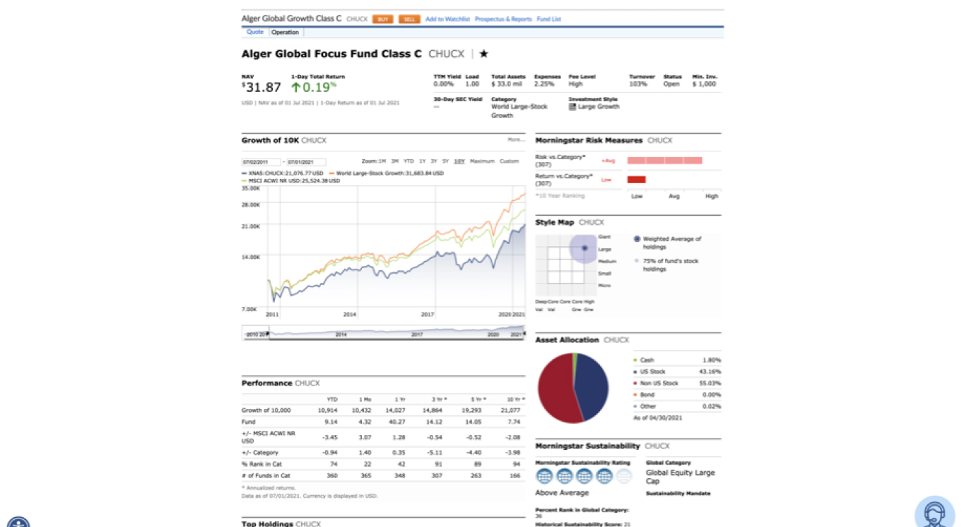

I conducted a heuristic audit of top tier competitors to identify industry standards for data density and mobile responsiveness. This evaluation revealed that while competitors successfully prioritized high value data above the fold, they often lacked a cohesive data flow for smaller viewports, creating a distinct opportunity for a more resilient, mobile accessible solution.

-min.jpg)
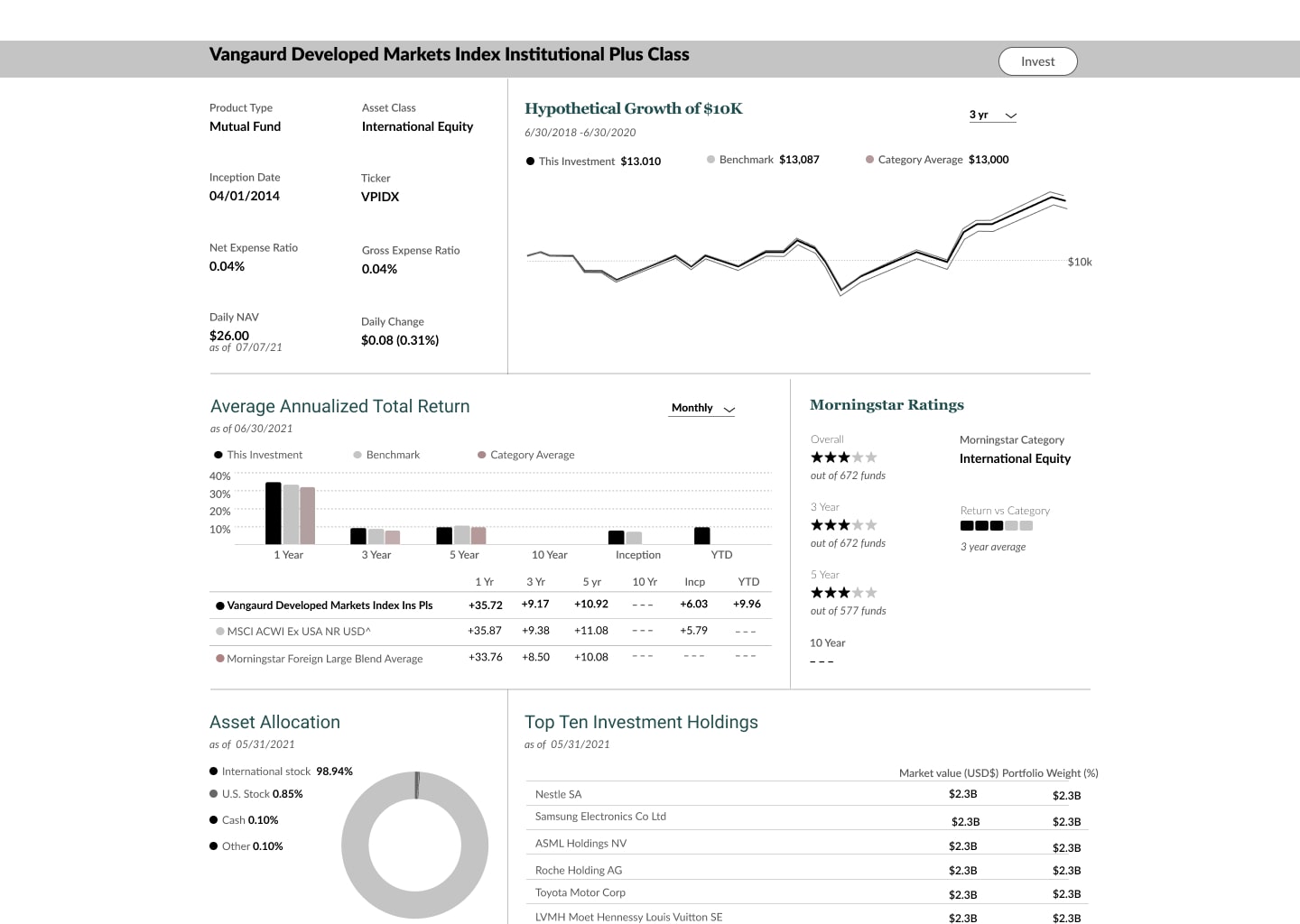
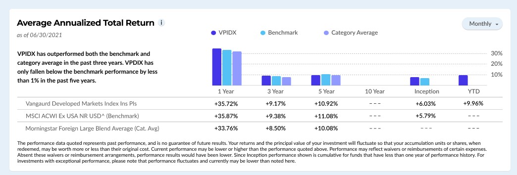
I initially experimented with radial gauges to display multi-year returns. While visually modern, they proved difficult for users to compare accurately against benchmarks at a glance. I pivoted back to a refined bar chart and table combination to ensure precise data comparison.
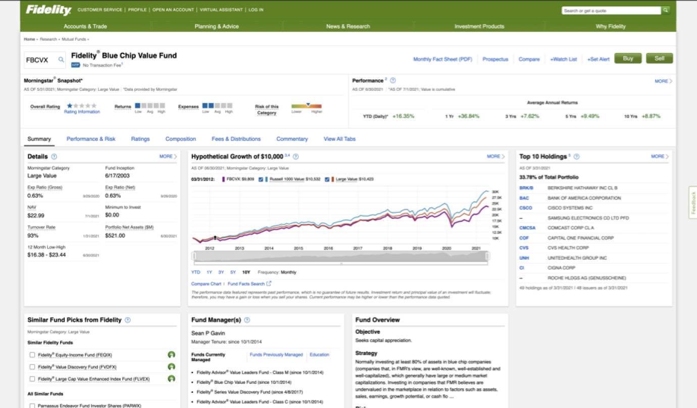
.jpg)
I moved away from a static grid to a responsive "card" system. Each data set is contained in a rectangle that reorders logically as screen real estate shrinks. This ensures a seamless transition from desktop to mobile without losing the correlation between relevant data points.
Financial data often triggers user anxiety. I implemented a calm, inviting palette designed to reduce stress. More importantly, I rebuilt the color system to exceed WCAG standards, replacing inaccessible green/blue combinations with high contrast, legible alternatives.

I introduced a secondary "Bookmark" icon to support long term research cycles. By using a standard bookmark metaphor instead of an ambiguous "eye" icon, I reduced the cognitive load. This keeps the primary focus on the "Invest" button while supporting the user’s comparison journey.
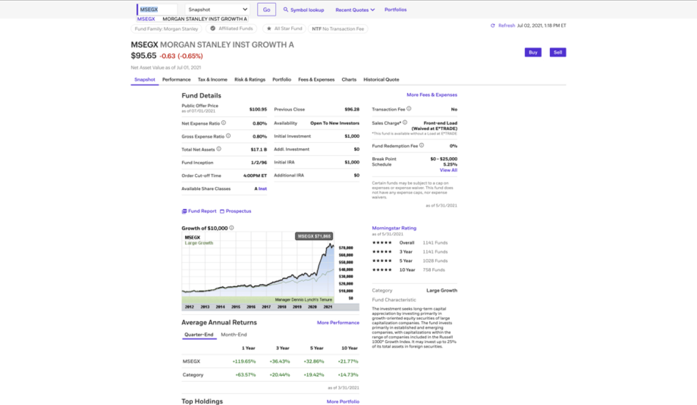
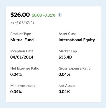
I prioritized critical metadata—specifically Price and Daily NAV—to ensure these primary indicators of fund health are the most prominent elements on the page. By maintaining consistency with legacy TIAA data points and industry benchmarks, I ensured that the redesign feels familiar to power users while leveraging a refined typographic scale to improve scannability. This strategic placement allows investors to perform a "pulse check" on their assets in seconds without navigating deeper into the page.
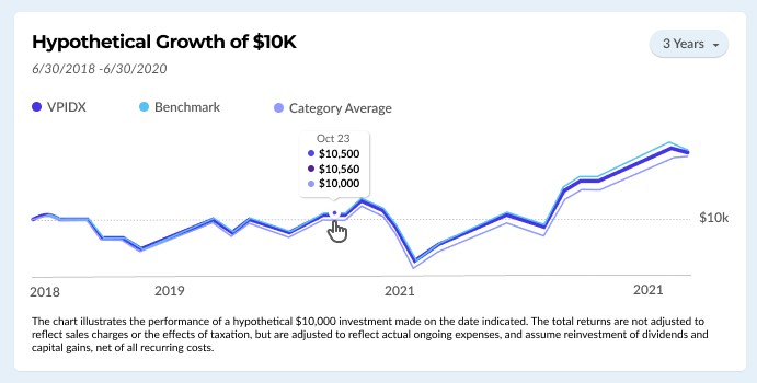
I restructured the layout to ensure that the "Growth of 10K" chart and core pricing indicators are immediately visible. This satisfies the primary user intent without requiring a single scroll. To reduce UI clutter, I replaced static axis labels with a slider tool. This allows users to pinpoint exact returns on specific dates without overwhelming the viewport.
I consolidated bar graphs and table labels into a single view. This reduces white space and allows for "smart text" summaries that explain the "why" behind the numbers.
.jpg)